Saturday, 6 March 2010
production log
Today I recorded my focus group questions and answers, when I go home I am going to edit the the recording to make it sound better.
Wednesday, 3 March 2010
1ST DRAFT MAGAZINE COVER 03/03/10
 This is the first draft of my front cover of my magazine . I decided to stick with the colour scheme of blue and grey after trying out a variety of different colour schemes. this is only the 1st draft so i think i need to make a lot of changes in terms of making my magazine look professional and making the text stand out. In my final draft i will also smoothing the face of the main image as way of image manipulation. As part of the image manipulation i changed the colour of his clothing and hat from black to a navy blue as this was my colour scheme. So far i think a lot of development needs to be made this week.
PICTURES
 This is the picture i decided to use for my front cover as it reflects music with the simple prop of a microphone. this image also shows direct address as he is looking at he audience therefor engaging them to read/ buy the magazine. I am to manipulate this image for my front cover so that my front cover looks professional. I will also cut out the image using the magic tool so that the image is left without a background.
Rejected images
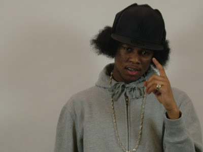
 This image doesn't work simple because the camera was out of focus and the artist is not giving direct address so it wouldn't appeal to the reader if include this picture. This image also has a small number of props the hat, chain and ring. Although these props have the connotations of wealth it doesn't look like it could be related to music.
Rejected images
Tuesday, 2 March 2010
Front Cover typeface
 these are the fonts i tried out for the front cover of my magazine. The 1st font is too simple and for this reason I didn't use it.
The second font is too fancy as it looks like neat handwriting. It doesn't look like it will attract the audience.
I think that the third is very effective. It looks like it will appeal to the younger generation as it is a graffiti like typeface. For these reason i used this font and developed it using software such as adobe photoshop and illustrator.
This is the last font I tried out. This font didn't work as well as the previous one. It also looked a bit too plain and wasn't attractive.
Subscribe to:
Posts (Atom)
